 Behind the Scenes at the Museum with curator Danny Bills
It has been said exhibition curation could be compared to making a movie. The curator is like a movie directory, conceptualizing the exhibition and overseeing all production details, such as selecting artworks and arranging them in space, managing a skilled team, facilitating art shipping, setting dates, planning an opening event, and budgeting, writing, marketing, installing, and problem solving.
Although may curators share a common purpose, there is not one singular process that every curator uses. As we lead up to major exhibitions, I will share with you my process. I hope to give you an insider perspective of art exhibitions and a personal connection to the museum experience.
Danny Bills, Curator of Exhibitions and Collections
Color in Art, Color in Life: Prisms, Pigments, and Purpose
Join the process behind creating the exhibition Color in Art, Color in Life as the Museum curator explores color in art through phycology and artists Scottie Parsons, Roger Shimomura, and Roy Lichtenstein.
Curator's Clues: Color Field
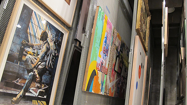
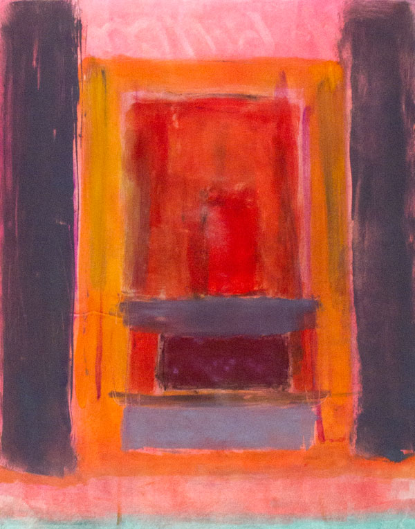
Color in art is a broad topic, so to narrow it down, I’m focusing on a natural starting place: color field painting. Simply defined, color field painting is a style of mid-20th century American abstract painting, which features large expanses of color as its subject. The Museum collection includes color field works by Wichita Falls artist Scottie Parsons.
You may have noticed that different colors affect your emotions: think ‘bright’ reds versus ‘cool’ blues. Looking at Parsons’ work, do you feel energized, or does the painting have a calming effect? If you’d like, share your thoughts here. Next time, we’ll talk about how artist Roger Shimomura uses color.
Oil monotype. Museum purchase,
Collectors Circle, 2012.
Curator's Clues: Roger Shimomura
Collectors Circle purchase 2019.
Further narrowing the broad field of color, I’m focusing on artists who use primary colors – red, yellow and blue — which have scientific and art historical significance. Today, I’m considering works by Roger Shimomura, recently acquired for the WFMA Permanent Collection by the 2019 Collectors Circle.
Born in Seattle in 1939, Roger Shimomura is a contemporary artist and retired professor of the University of Kansas in Lawrence, where he taught for 35 years; a distinguished military graduate from the University of Washington in Seattle; and a former field artillery Captain in the Korean War. During World War II, during Shimomura’s childhood, he experienced incarceration with his family at Japanese-American Internment camps.
I have relied heavily upon family oral history as well as on the published and unpublished stories written by my late grandmother . . . I have also referred to old family photographs, and most important, Mrs. Shimomura’s personal diaries, maintained by her for 56 years. This vast collection of materials has been integrated into my personal accumulation of videos, films, slides, writings, audio tapes, and other materials related to cross-cultural matters.
-Roger Shimomura, October 1993
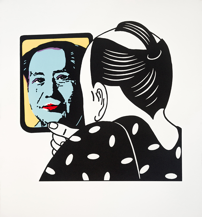
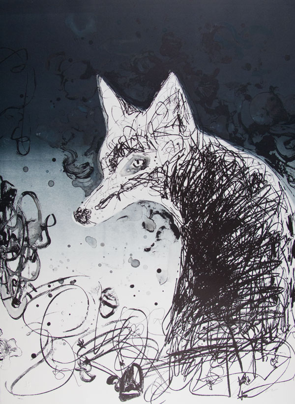
![]() Throughout his long artistic career, Roger Shimomura's art has presented a thought-provoking examination of Asian American sociopolitical experience, and this print's complex subject matter is no exception. For our purposes today, we will consider only the roles color plays in this piece. I've chosen this print for our upcoming exhibition about the language of color for two primary reasons.
Throughout his long artistic career, Roger Shimomura's art has presented a thought-provoking examination of Asian American sociopolitical experience, and this print's complex subject matter is no exception. For our purposes today, we will consider only the roles color plays in this piece. I've chosen this print for our upcoming exhibition about the language of color for two primary reasons.
The first involves the use of a triadic (three-part) color harmony or scheme and its scientific and art historical significance. The most common scheme uses the colors red, yellow, and blue, as you see in this print. From a scientific perspective, these three colors, known as primary colors, can be mixed to form any color or placed close together to optically mix into another color. Art historically, the European avant-garde artists of the middle 19 th century radically experimented with primary optical color mixing in a painting style called Pointillism, part of a larger movement called Impressionism. Later in the mid-20 th century in an art movement called Pop Art, American artists such as Andy Warhol employed primary colors as a printer would, to make commercial art and its popular culture imagery the critical subject of their works.
The second reason involves the use of color in Shimomura’s Mao to intermix American and Japanese visual art and cultural histories. The print features an appropriated image of Mao Zedong, founder of Chinese communism, that was first appropriated by Andy Warhol from propaganda photographs for Warhol’s 1970s silkscreen prints of famous people. This image looks out from a mirror to a black and white image that reimagines a warrior figure typical in traditional Japanese woodcut. By combining these styles and images, Shimomura draws together 1960s and 70s world political history, Pop Art commentary, and traditional Japanese art and history, still relevant today.
In our exhibition, by focusing color in a small area of the image, Shimomura’s uses of triadic color harmony, political references, and appropriated famous imagery create a dramatic focal point, using the power of color to invite conversation about the complex relationships reflected in the mirror across time.
Since the 1800s artists have been drawn to the scientific nature of the triadic color scheme as a tool for experimentation and emphasis in both technique and subject matter. Triadic color harmony is demonstrated in multiple places in the WFMA collection, most notably by American Pop artist Roy Lichtenstein, who we will consider next.
Curator's Clues: Roy Lichtenstein 
A print series by American Pop artist Roy Lichtenstein continues our focus on the use of red, yellow, and blue (primary colors). Lichtenstein (1923-1997) was best known for his use of comic strip-style imagery that copied the fast and cheap newspaper printing process, including the exclusive use of the triadic color scheme.
In the 1960s, after Army service in World War II and advanced art studies at Ohio State University, Lichtenstein became a leading figure in the new Pop Art movement. He was influenced by advertising and the style of comic books.
The news industry’s mass printing method relied on repetition of small colored dots, typically cyan (blue), magenta (red), yellow, and black. These dots, known as Ben-Day dots, after printer and illustrator Benjamin Henry Day, Jr., were variously spaced and combined to create value and color. Lichtenstein enlarged and exaggerated these dots and their triadic color scheme in his art.
Why did Lichtenstein use color and imagery this way?
Lichtenstein took the commercial, scientifically based way of optical color mixing and blew it up in scale as an avant-garde twist. By doing so, he dispels the representational illusion commercial printing creates. Lichtenstein’s new larger Ben-Day dot no longer mixes optically but stands proud as its own art element. This became the artist’s signature separation of color, showing his subjects are not reproductions but stand on their own.
Lichtenstein explains, “My use of evenly repeated dots and diagonal lines and uninflected color areas suggest that my work is right where it is, right on the canvas, definitely not a window into the world.”
Even after he largely abandoned the use of comic book images in 1965, Lichtenstein kept the commercial printing look and use of dots in pieces such as “Industry in the Arts (II)” acquired by the WFMA in 1971 and in his suite of six prints titled “Bull Series I-IV” acquired by the WFMA in 1975 with help from the National Endowment for the Arts.
Read about the artist’s work at the Lichtenstein Foundation website.
Read more about the Bull Series on our website at http://wfma.webserv1.local//museum-education/…/curators-clues/
Thank you for joining me on the journey of organizing this exhibition. We will explore other aspects of color in our next installment.
Curator's Clues: Color
The first step in planninga ny exhibition is conceptualizing its overall purpose. For our fall exhibition, I'm starting with a broad idea of theme: Color -- a vast subject worthy of conversation.
My goal is to use works from the museum's collection to demonstrate effective uses of color, not limited to the field of art or design. In addition to my thoughts on the subject, I may invite other contributors from fields such as science, history or literature, as the language of color is universal.
Initial mission statement for the show: Exhibition focusing on the emotional aspects of color: effects on people, effects on the environment. Study of color in art, design, science and history, in some cases as far back as the 1700s.

Curator's Clues: Behind-the-Scenes with Curator Danny Bills
This week I’m looking at color from a scientific perspective, which leads to recognizing ways color affects us, both emotionally and physically. In the 1660s, English mathematician and physicist Sir Isaac Newton pinpointed the ROYGBIV colors (red, orange, yellow, green, blue, indigo, and violet) that make up the visual spectrum or the colors that humans cans see. In 1722, Jacob Christoph Le Blon was the first to outline a three-color printing method using primary colors to create secondary colors. In 1810, creative writer Johann Wolfgang von Goethe wrote “Theory of Colours,” which argued that color was not only scientific measurement, but also an individual experience that each viewer could perceive differently. With this information, we can see that artists and designers would be able to understand how colors are formed and how viewers may react to an artwork color psychology.
Explore on your own:
https://www.brainpickings.org/…/17/goethe-theory-of-colours/
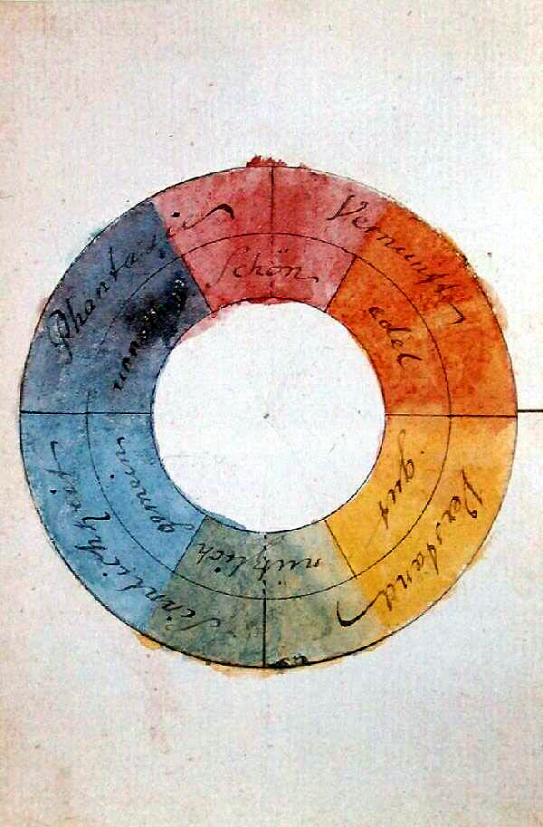
Johann Wolfgang von Goethe
in 1809.
Explore other past exhibitions with Curator’s Clues.
Art from the Collectors Circle: Expanding the Legacy
Follow the story of the WFMA Collectors Circle as curator Danny Bills prepares for the retrospective of artworks acquired by the museum’s Collectors Circle.
Quilt Journeys: Women’s Voices
Take a look at the WFMA quilt collection with Curator Danny Bills as he askes the question: How did they get here?
-
Tuesday - Friday
10:00AM - 5:00PMSaturday
1:00PM - 5:00PM